
House2Home
E-commerce Website Design
How House2Home Improved Their E-Commerce Website to Show Customers How to Decorate Their Space on a Budget

The Basics
Company Project Time My Role
House2Home Google Design Sprint 1 week-Design Sprint Product Designer

Day 1: Understand the challenge and map the current state
The first day of a design challenge is often considered the most crucial. It is the day where everyone (assuming there’s more than just one person) comes together to answer some critical questions:

Critical Questions
Why are we here? What’s the challenge we are taking on?
What is our long term goal?
What are the problems we might face?
What does the current state of the user’s journey look like?
What are others (competitors) doing?
With most design sprints, you are most likely collaborating with at least 4+ other team members, as well as bringing in 3-5 experts for additional insight on the project.
In this particular case, I am a design sprint team of 1, and am working on a slightly more accelerated timeline within each core day. Because of that accelerated timeline, I have listened and synthesized project research, and have determined the following:

Journey Map(s)
How will I get from where we are now, to my listed end goal?

I focused on Journey Map #3

The website has two main users
House2Home User 1
Launch website
Filter their search by one or more characteristics
View item results
Select items
Add items to cart
House2Home User 2
Launch website
Request virtual interior design assistant
Communicate needs to interior design expert (ie. budget, style, etc.)
Expert finds items for customer and shares several “look” combinations.
Customer selects look
Add look to cart
Now that user journey maps have been created, it was time to reference user quotes gathered earlier when synthesizing research, and create HMW statements:
How might we provide quick and easy facelifts to one’s new home?
How might we create a personal assistant experience to customers?
How might we make looking for interior home items as easy as looking through Pinterest?
How might we make choosing home decor items as easy as choosing a new outfit?
Day 2: Sketch out options
After spending the first day understanding House2Home, and their challenge, it was time to put pen to paper (or in this case, pencil to paper :) ) and come up with some solutions.
Note: In-between sketching, it’s important to be recruiting people for your Day 5 Test day! At this point, I’ve sent out an initial feeler, through a survey and a general note, looking for people who are willing to participate. From those who are willing, I will start contacting them to set up a firm day and time.
Sketching
I started my sketching process by running a 30-60min round of lightning demos. What better way to start any initial design process, than by spending some time looking at inspiration through existing ideas and solutions other websites feature? Through a series of screenshots, I created a collage, and assigned one sticky note per screen shot, noting the feature that caught my eye about each, during exploration discovery.

Now that I was more inspired and have ideas, it’s time to start putting those ideas to paper and see what solutions come forward. Leveraging the well known Crazy 8’s sketching method, I was off..

Re-reviewing the House2Home challenge, I closely looked at all 8 sketches, and the idea of pursuing an Interior Design Assistant guide of some sort, felt like the right direction to move forward in. Sketch #6 was the one that could get us there. Let’s start storyboarding..
V6A V6B

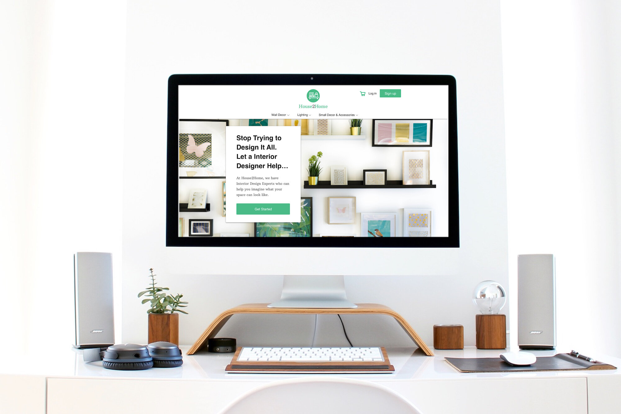
The screen before the critical screen, features an interior design expert call to action, aiming to relieve the user of any apprehension going into what can often feel like a tasking endeavor. For the users who want to look for an individual item, rather than a thoughtfully orchestrated look from our experts, they have the option to do so by searching by style, category, color, etc.
The critical screen is the Expert Page:
V6A: Gives the user a sense of an interior design guide, through the user filtering their search based on their budget , style, room type, and color.
V6B: Gives the user a sense of sitting down with an interior design expert/consultant through a live chat session. The Interior Design Expert will ask you a series of questions around your room type, your style, your color aesthetic, and of course - your budget. This will allow him or her to provide you with the best item results.
The screen that follows the critical screen, is the Your Looks screen. The screen shows the users filtered options, and creates multiple options for them to choose from, as well as allowing the user to mix and match items from one look to another.
Day 3: Decide on the path to take
Now that solutions have been sketched, it was time to choose which one to move forward with, and create step-by-step panel storyboard of how the solution would unfold.
Note: At this time, I’ve reached out to 5 willing usability participants, and scheduled a 30 min video call with each of them, for Day 5 Test day.
Critique
After going over the two primary storyboard sketches from Day 2, I chose to move forward with version 6B. Offering a virtual interior designer assistant feature, where the user could message their needs back and forth to an experienced designer, provides a unique user experience, while at the same time offers a personal touch, that many of us crave in the digital world.
V6B

Storyboard Solution
Now that I have a winning design solution, it’s time to put together a play by play of how the prototype will start unfolding before I start building the prototype. I personally enjoy creating a frame-by-frame plan using a whiteboard. Though the one I own is small, it does the trick :), and I was able to sketch the opening screen to the end screen.

Day 4: Build your prototype
It was time to create a realistic facade of what was represented on my storyboard. This would allow me to get something in front of potential customers, who may have purchased or rented a new home (including apartment), and are looking for ways and help to style it up. Ultimately, running usability tests would provide answers as to whether or not offering a customer a virtual interior design expert, would solve the initial challenge.
Prototype Tools
I used Sketch to create hi-fidelity screens, leveraging some UI Website kit’s to pull standard features and buttons, in order to save some time. After several hours creating the 6+ storyboard screens, and building an interactive prototype through InVision, I ran two trial runs to catch any mistakes and anything that felt off. To no surprise, I found several that I quickly fixed and felt more confident moving forward getting it in front of customers.

Let me just say, for someone who finds themselves in the details of any project, it was a challenge for me to keep the hi-fidelity screen building, and prototyping to a day. Realistically in a Design Sprint, there would be other designers involved, making it more feasible to divy up storyboard tasks, and assign specific roles. This definitely would accomplish more in a shorter period of time, but since I am a one woman show, I wore all the hats. 🙂
Day 5: Test your solutions
After four days of analyzing and preparing, it was time to get the prototype in the hands of customers, and listen to what they had to say.
What I Learned From the Tests
I asked 5 individual females for feedback. By no means was it intentional to only test with females. In fact, getting a male’s perspective would have been useful. What I wanted to understand was, how did each woman respond to having a virtual interior design assistant at their finger-tips? So, I asked each woman to complete 2 tasks…
How would you look for help if you needed guidance on styling a room?
How would you add an entire look to your cart?

As I watched each woman go through the tasks, my goal was to uncover any usability problems in talking to an expert and adding an entire look to their cart.

Observations
Participants found the “get started” feature easily when it came to looking for interior design help.
Most of the participants stated that they would like having a professional designer to help them find the right items for their home.
Some participants had a hard time seeing the “select entire look” feature to add to cart, and thought they had to add each item within the look individually to the cart.
Potential design change: Make “select entire look” feature more noticable. Don’t make the user have to work to find it.
Conclusion
Based on the positive user testing feedback, the solution to offer a virtual interior design assistant, not a bot, but an actual human expert on the other side, to help guide and support the user through their new design challenge, is a feature that could be widely appreciated and utilized on House2Home. With of course..some refinement :)
In addition to the solution, I would suggest working and building the following:
Build out the mix and match product items feature.
Create additional product search features.
(ie. shop by color, category image cards on the Home screen, and active drop down menus for top navigation categories.)
Create check out and order confirmation screens.
*All information in the projects are my own and does not necessarily reflect the views of respective companies.